Free data analysis using R
In this blog post, Alan Parker – scientific consultant and physical chemist at Rational Formulation – explains how the free software ‘R’ can be used for data analysis Figure 1 - Graph showing distribution of capsule properties. Created with R
Data analysis is one of the most frequently mentioned training needs on AuthorAID. To do data analysis, we need software. I strongly advocate the use of R, an open source programming language.
Here I will outline several good reasons to use R, which is totally free. However, the fact R is free does not mean it is of low quality. It is written, and used daily, by many of the world’s best statisticians and data scientists. A highly professional team ensures regular upgrades and bug fixes. It runs on Windows, Mac and Linux. For big problems, it can even run on clusters of computers. The well-known data analyst Nate Silver uses R extensively to predict the results of US elections. Check out his web site: fivethirtyeight.com.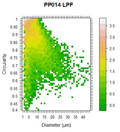
R is extremely powerful, but it can also be used for small data sets, because you can type one line programmes straight in and they will run immediately. For example, plotting a histogram on R is easy (unlike on Excel). Here’s how to do it: let’s say that you have some data in a list that you’ve named x. You just type hist (x) and a neat histogram is created instantly. R has hundreds of powerful commands to do data analysis.
Figure 1 is an example of a graph that I made with R. You can find many others by Googling “R graphics gallery”. I had data for the size and shape (“circularity” on the y axis) of thousands of perfume capsules. I wanted to show how these capsule properties were distributed. Colour is used to indicate how often capsules with a particular size/shape pair are found in the sample. Pink indicates very common. Green means rare. The graph shows that small, circular particles are most frequent (top left). But there are also a few large, non-circular particles (middle right). We used this graph to immediately identify unusual samples.
Figure 2 is another beautiful graph, this time taken from the online R graph gallery. This graph compares how seven varieties of plant responded to two treatments. There were many plants in each sample, so each variety/treatment combination is presented as symbol that has: 1) a bar for the mean; 2) a box that includes values between the first and third quartiles; and 3) a thin line that includes one standard deviation above and below the mean. Outliers are shown as black blobs. There is a lot of information presented in a very clear and attractive way here.
Figure 2 - 'Grouped boxplot with ggplot2'. Graph created with R
R’s community and resources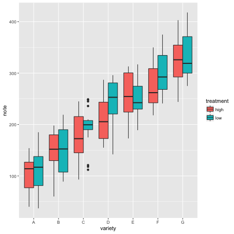
One of the best things about R is its great user community. There are tons of tutorials, blogs and forums covering every imaginable subject. You can find many (about 500) blogs gathered on the umbrella site “R bloggers”.
Probably the main reason for R’s success is its system of add-ons, called “packages”. There are now an incredible 11,000 of these, all free. Each package extends R by adding extra functions that are ready to run. Just download the package and it’s ready to go. Also included in the packages are help for each extra function and a tutorial introduction. There are packages for many different types of analysis, for example: “Spatial Designs for Ecological and Environmental Surveys” and “Stochastic Mortality Modelling”. There is even a package that imitates the hand-drawn graph style of the popular scientific cartoon strip “xkcd”.
To navigate the mountain of add-on packages, there is a special site: CRAN. Inside CRAN you will find 35 “task views”. Each of these is a summary of the key packages devoted to a single area of data analysis, such as “Environmetrics”, “Meta Analysis” or “Social Sciences”. “Spatial” is a task view that covers the creation of maps with data included. If CRAN is a bit overwhelming, you can find a shorter, more user-friendly list at “Awesome R” (https://awesome-r.com/ ).
I must say that using R alone is not much fun. You just get a lonely “>” symbol, waiting for you to type something (like the console of Linux or MS-DOS). However, in the last few years, a great free user interface has been developed: “R Studio”. In my opinion, no one should use R without R Studio. It gives you a screen with four windows: one to type in, another for your scripts (bits of programme that you want to save), a third showing your plots and a last one showing the history of what you’ve already done. With all this at your fingertips, you can easily flip back and forth: trying things, making mistakes, correcting them and moving forward.
R scripts and reproducible research
In R, there are several kinds of script. The one that I use is called “Rmarkdown”. I write a mixture of working code and comments, with simple symbols to separate them. This script is already an exact record of what I did and why. Even better, at the touch of a button, I can convert my script into a nice-looking Word or HTML file. These can easily be turned into a report or blog post.
Scripts are essential, because documentation is a vital part of data analysis, both for you (“Why did I do that?”) and, more generally, to conform to the norms of reproducible research. Reproducible research – i.e. the capacity to repeat a study and the data analysis anywhere by anybody – is the gold standard. It is key to any scientific method, including in applied social sciences. To meet this standard, your publications must include the data that you gathered and the data analysis, so that anyone can replicate exactly what you did. At the moment, very few papers meet this standard. However, due to the recent “crisis of reproducibility” caused by discovering that many studies cannot be repeated, more and more journals will insist upon it. To make data analysis repeatable, the programming tool must be freely available and open source, so R is ideal.
I hope that this brief introduction has given you the motivation to download R (and don’t forget R Studio) and try it. I should say that I am not a trained statistician or computer programmer. I picked up R because I needed a tool that was more powerful than Excel. I must admit that the transition needs a little commitment, but once you are up and running, I guarantee that you’ll impress your colleagues with the results.
Alan Parker is a scientific consultant for Rational Formulation, Annecy, France. He is a physical chemist who has worked in R&D in a range of industries over more than 35 years. He has 40 peer-reviewed publications and six patents, and he recently founded his own scientific consultancy.
Useful links
R Project homepage (with free download links)
https://www.r-project.org/
R Studio
https://www.rstudio.com/
R Bloggers
https://www.r-bloggers.com/
CRAN packages
https://cran.r-project.org/web/packages/available_packages_by_name.html